Google Cloud
UI/UX Project with Google Cloud Services
This project was commissioned by the Google Cloud Services Department to enhance user engagement on the Google Cloud Platform website (cloud.google.com). The core requirement was to propose optimizations for the website's current layout and interactive flow, aiming to increase the user base among the targeted customer groups.
Project Challenges and Solutions
The main challenges identified on the Google Cloud Platform website included a complex array of products and features, making it difficult for users to select and compare options effectively. Additionally, the site suffered from cluttered interactions, a lack of personalized feedback, and a deficiency in highly interactive page functionalities.
Focusing on the needs of Google Cloud Services, the target audience for the website was identified as startup CEOs, tech professionals, and university students.
The goal was to refine optimization and design efforts to facilitate quicker and more convenient decision-making among these users.
Addressing these challenges, our team proposed solutions centered on two key aspects: 1) Enhancing the website's interactive flow and design layout and 2) Incorporating features with higher interactivity, such as chatbots, personalized product comparison pages, and user interaction feedback modules. The design solutions were presented as high-fidelity prototypes and received positive feedback from the Google Cloud Services Department.

Research and Discovery
Stage 1. Initial Research and User Understanding
My Role: Lead Researcher
Responsibilities:
Conducted desktop research to refine user journey maps and competitive analysis.
Designed and led user interviews for an in-depth understanding of user experiences.
Approach:
Employed a mix of desktop research, market analysis, and semi-structured user interviews.
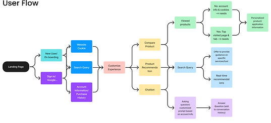
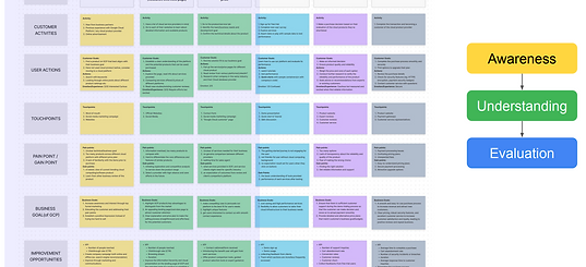
Created user flow diagrams, user journey maps, and competitive analysis charts to identify and analyze product pain points.
Outcomes:
Identified key issues with the Google Cloud product page, proposing several solutions.
Developed low-fidelity prototypes based on refined task priorities and design trend research, tailored to meet user needs and current market trends.

Initial Design & Evaluation Phases
Stage 2: Initial Design
My Role: Design Coordinator and Lead Interviewer
Responsibilities:
Led user interviews and designed research questions. Coordinated design issues with designers and clients, assisting in modifying UI and UX design plans.
Process:
After gaining a clearer design direction and discussing with clients, we created high-fidelity prototypes. Prepared a second round of user research focused on Version A of the design, using questionnaires to identify initial design challenges.
User research revolved around high-fidelity prototypes and was conducted via semi-structured interviews with image displays.

Design Revision & Evaluation Phases
Stage 3: Design Evaluation and Revision
My Role: Feedback Analyst and Design Coordinator
Responsibilities:
Summarized user feedback, prepared analytical reports, and coordinated design issues with the design team and clients. Assisted in modifying design solutions using Figma.
Outcomes:
The final product design focused on optimizing the landing page layout, incorporating a chatbot for improved interaction, and adding personalized product comparison features.

Final Solution and Explanation
▼The Landing Page
The final design of the landing page is improved to be more streamlined compared to the original product, allowing direct guidance for users to prioritize experiencing personalized product recommendations, particularly through the 'Customize Your Experience' button.

Landing Page Demo
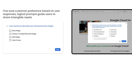
Upon interacting with the 'Customize Your Experience' button on the landing page, users who are not logged into their Google account will receive a survey-style pop-up. This pop-up collects information about their product needs and application scope. Based on the user's feedback, they will then be directed to the Product and Solution Page.

Product & Solution Page
After completing the questionnaire, users are directed to the Product & Solution Page, where a list of products that may interest them is displayed. If users require further guidance, they can interact with the dialogue box icon on the right to utilize the Chatbot service.

AI Chatbot
The website's chatbot is always accessible, floating on the right side of the webpage and available from any position on the site. If users prefer not to engage in intricate interactions within the page, they can use this service at any time. The bot provides personalized product recommendations based on user input in the chat box.
The chatbot guides users from the chat box to the Product Compare Page if they are indecisive about different products. Here, users can view detailed product information and pricing.
Users also have the option to use the comparison tool directly via a button on the page.


Product Compare Page
Based on the feedback previously collected from users, the Product Compare Page displays personalized recommendation options. Additionally, categories are shown in the left-hand navigation bar to facilitate users in browsing and comparing information across multiple products

'Categories' section in Product Compare Page
Users can access detailed comparisons of cloud products in the 'Categories' section of our Product Compare Page.
The page highlights specific product information, real-world applications, and distinctive features in the current market.
This design choice was driven by user research findings, where over 80% of participants emphasized the importance of understanding market applications and differentiating product uniqueness.

The Categories section also features a horizontal comparison of prices and storage space differences between various cloud products, aiding users in making more informed choices.

